Distribution > Two Variables | Difficulty: Easy
Relationship > Two Variables | Difficulty: Easy
.
TABLEAU
COLUMNS: Measure
ROWS: Measure (different)
MARKS
DETAIL: Dimension to identify (optional)
COLOR: Dimension to group (optional)
SIZE: add a third Dimension (optional)
(see bubble chart)
WHAT IS A SCATTER PLOT?
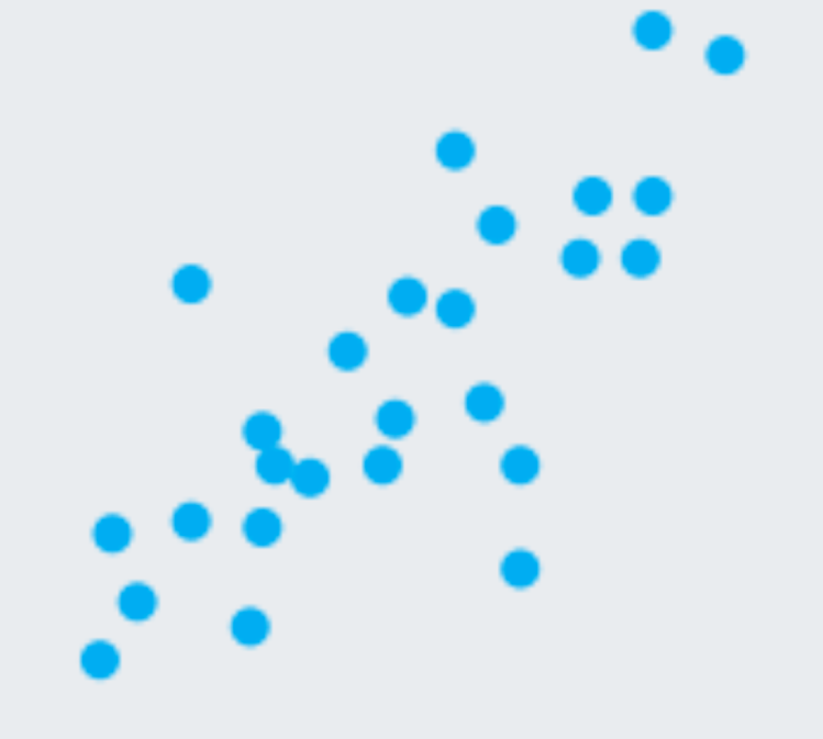
A scatter plot (aka scatter chart, scatter graph) uses dots to represent values for two different numeric variables. The position of each dot on the horizontal and vertical axis indicates values for an individual data point. Scatter plots are used to observe relationships between variables.
WHEN TO USE A SCATTER PLOT
Scatter plots’ primary uses are to observe and show relationships between two numeric variables. The dots in a scatter plot not only report the values of individual data points, but also patterns and correlations when the data are taken as a whole.
Source: Chartio
EXCEL
INSERT > CHART > INSERT SCATTER OR BUBBLE CHART > SCATTER
Add a trendline (optional)
RIGHT CLICK CHART > ADD TRENDLINE…
