Distribution > Single Variable > Few Data Points | Difficulty: Easy
.
TABLEAU
SELECT:
1 Measure
→ Show Me → Histogram
WHAT IS A BAR HISTOGRAM?
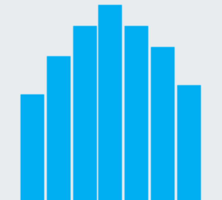
A histogram is a chart that plots the distribution of a numeric variable’s values as a series of bars. Each bar typically covers a range of numeric values called a bin or class; a bar’s height indicates the frequency of data points with a value within the corresponding bin.
WHEN TO USE A BAR HISTOGRAM
Histograms are good for showing general distributional features of dataset variables. You can see roughly where the peaks of the distribution are, whether the distribution is skewed or symmetric, and if there are any outliers.
SOURCE: Chartio
EXCEL
INSERT > CHARTS > INSERT STATISTIC CHART > HISTOGRAM
