Composition > Static > Simple Share of Total | Difficulty: Easy
.
TABLEAU
SELECT:
1 or more Dimensions
1-2 Measures
→ Show Me → Pie Charts
WHAT IS A PIE CHART?
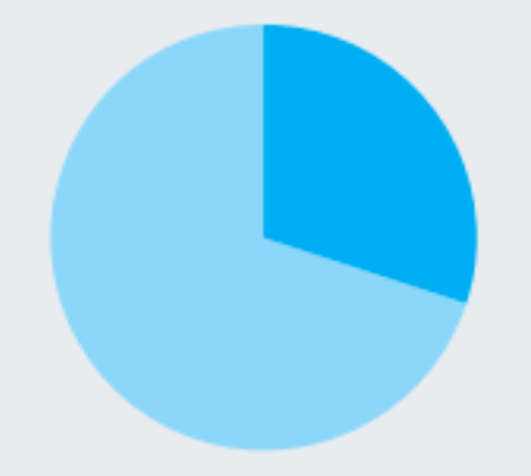
A pie chart shows how a total amount is divided between levels of a categorical variable as a circle divided into radial slices. Each categorical value corresponds with a single slice of the circle, and the size of each slice (both in area and arc length) indicates what proportion of the whole each category level takes.
WHEN TO USE A PIE CHART
In order to use a pie chart, you must have some kind of whole amount that is divided into a number of distinct parts. Your primary objective in a pie chart should be to compare each group’s contribution to the whole, as opposed to comparing groups to each other.
Source: Chartio
EXCEL
INSERT > CHART > INSERT PIE OR DOUGHNUT CHART > 2-D PIE > PIE
