Comparison > Among Items > One Variable per Item > Few Categories | Difficulty: Easy
Comparison > Over Time > Few Periods > Single or Few Categories | Difficulty: Easy
.
TABLEAU
HORIZONTAL BAR CHART:
SELECT:
0 or more Dimensions
1 or more Measures
→ Show Me → Horizontal Bars
VERTICAL BAR CHART:
Create a horizontal bar chart
Click on “Swap Rows and Columns”
WHAT IS A BAR CHART?
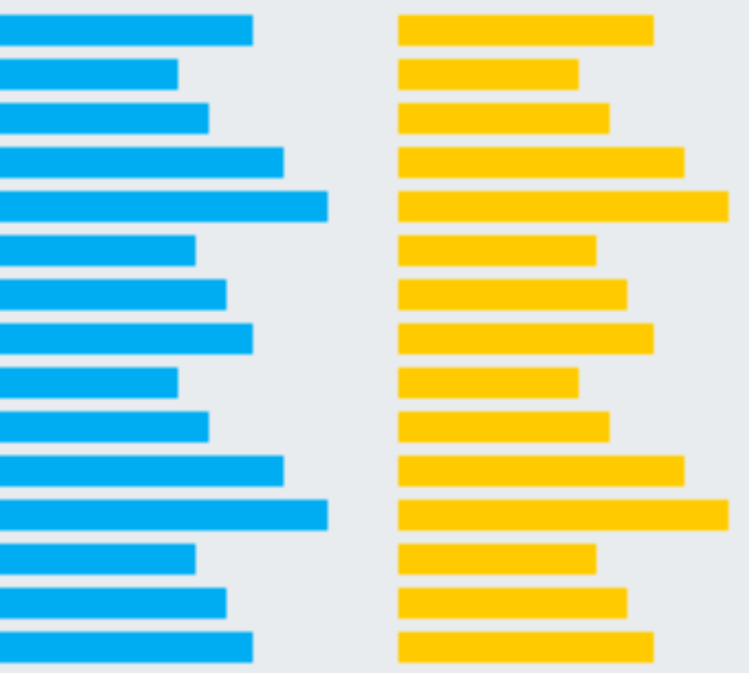

A bar chart (aka bar graph, column chart) plots numeric values for levels of a categorical feature as bars. Levels are plotted on one chart axis, and values are plotted on the other axis. Each categorical value claims one bar, and the length of each bar corresponds to the bar’s value.
While the vertical bar chart is usually the default, it’s a good idea to use a horizontal bar chart when you are faced with long category labels. In a vertical chart, these labels might overlap, and would need to be rotated or shifted to remain legible; the horizontal orientation avoids this issue.
WHEN TO USE A BAR CHART
A bar chart is used when you want to show a distribution of data points or perform a comparison of metric values across different subgroups of your data. From a bar chart, we can see which groups are highest or most common, and how other groups compare against the others.
Sources: Chartio
EXCEL
HORIZONTAL:
INSERT > CHARTS > BAR
.
.
VERTICAL BAR CHART:
INSERT > CHARTS > COLUMN
