.
.
.
.
Data visualization is the graphical representation of information and data. Charts, graphs, and maps, provide an accessible way to see and understand trends, outliers, and patterns to make data-driven decisions.
.
This site will help novice data analysts brainstorm the best chart to show your data and how to create them in Tableau or Excel.
.
If you are new to Tableau, take a look at TDS Beginner’s Guide which includes download and installation steps for students.
.
Otherwise take a look below at the 4 categories of charts or all the learning pages by difficulty to begin brainstorming!
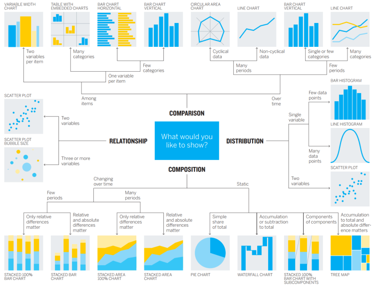
Chart Suggestions – A Thought Scatter by Andrew Abela


BEGINNER – EASY TO CREATE IN TABLEAU
SOME
POPULAR
CHARTS
TO EXPLORE:
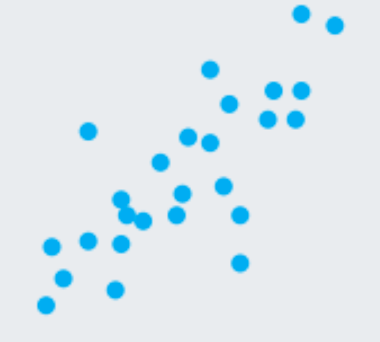
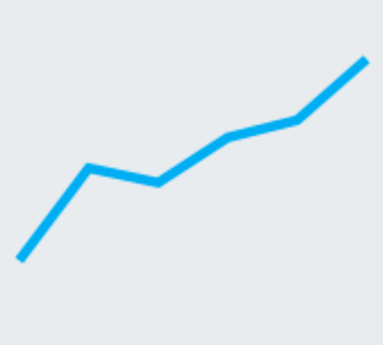
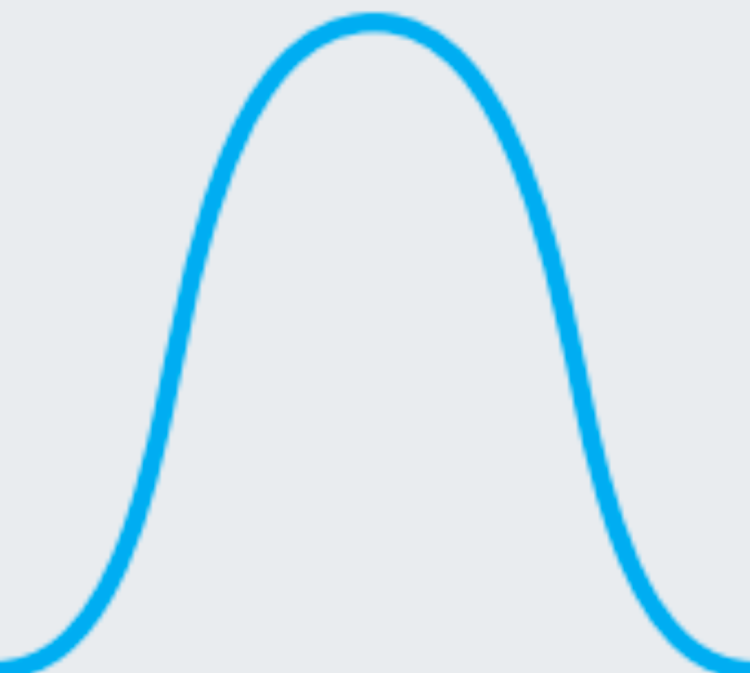
• line charts
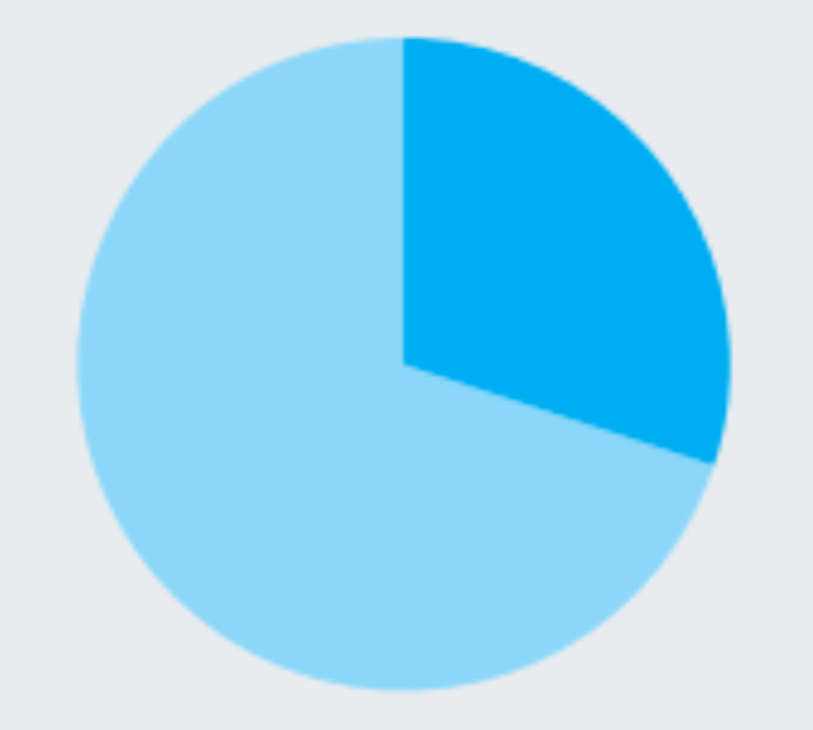
• pie charts
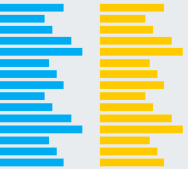
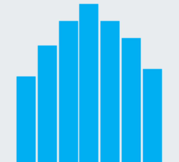
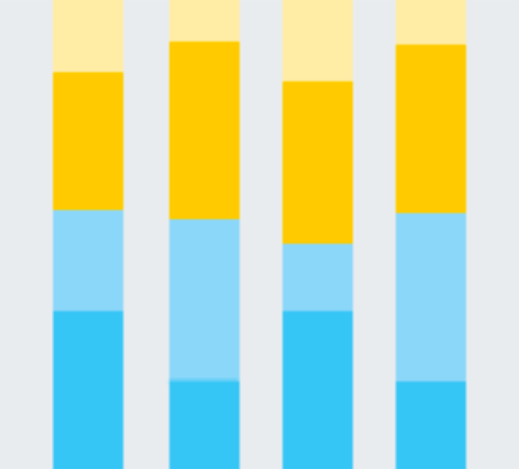
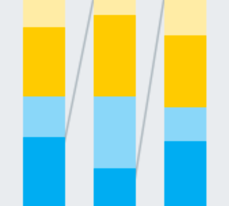
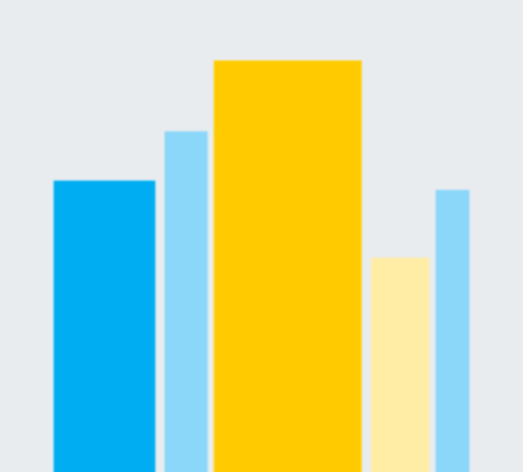
• bar charts
• histograms


MEDIUM

HARD


.
ABOUT THE AUTHOR
…..Kagen Quiballo is an undergraduate at University of Illinois Urbana-Champaign.
…..He will be graduating with a double major in mathematics and statistics, a minor in informatics (data management track), and certificates in data science and undergraduate research in May 2020.
.
ABOUT THE WEBSITE
…..With the Association of Research Libraries (ARL) Fellowship for Digital and Inclusive Excellence (AFDIE), Kagen created this website as a resource / libguide for beginner-level data visualization. During the COVID-19 pandemic, all institutions implemented online learning in March 2020. It is important to make information and resources digitally accessible to students.
.
THANK YOU
…..A thank you goes out to ARL this opportunity to work for the university library, to the AFDIE 2019-2020 cohort of amazing, supportive, and diverse individuals, and to my mentor and supervisor Jen-Chien Yu for the support during this project and fellowship.

.
.SOURCES
• Abela, Andrew. “Advanced Presentations by Design: Creating Communication that Drives Action.” 2nd ed, Wiley, 2013. Chart Suggestions – A Thought Scatter.
• “Create a Waterfall Chart.” Office Support, support.office.com/en-us/article/create-a-waterfall-chart-8de1ece4-ff21-4d37-acd7-546f5527f185.
• “Data Visualization Beginner’s Guide: a Definition, Examples, and Learning Resources.” Tableau Software, tableau.com/learn/articles/data-visualization.
• “Data Visualization: Types of Charts and Graphs for Data Viz.” Research Guides, Temple University Libraries, 28 Aug. 2019, guides.temple.edu/c.php?g=657544&p=4616459.
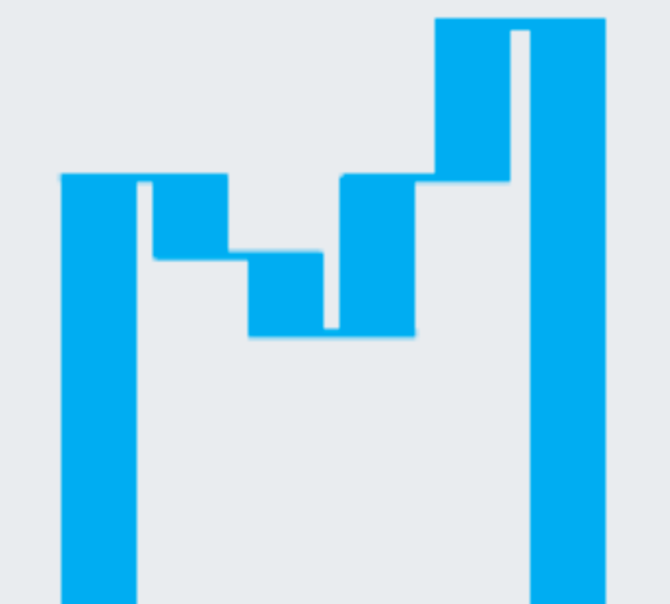
• “How to Create a Variable Width Column Chart.”, dundas.com/support/support-center/support-articles/data-visualizations/chart/how-to-create-a-variable-width-column-chart.
• Gulbis, Jānis. “Data Analysis And Visualization – Are You Doing It Right?” EazyBI, 16 Feb. 2016, eazybi.com/blog/data_analysis_and_visualization/.
• Jena, Shubhangi. “Tableau - A Beginners Guide.” Medium, Towards Data Science, 28 July 2019, towardsdatascience.com/tableau-c9d6962991ca.
• Oetting, Jami. “Data Visualization 101: How to Choose the Right Chart or Graph for Your Data.” HubSpot Blog, 20 Mar. 2018, blog.hubspot.com/marketing/types-of-graphs-for-data-visualization#sm.00000rjskeeastdqstj1u6344w1xx.
• “Tree Map.” Seeing Data, seeingdata.org/taketime/inside-the-chart-tree-map/.
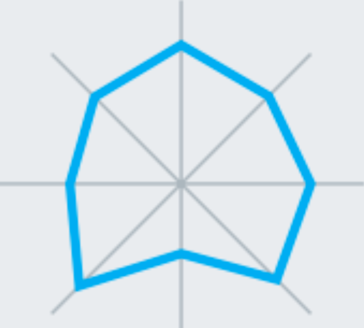
• Trajkovic, Jonathan. “Use Radar Charts to Compare Dimensions over Several Metrics.” Tableau Software, 4 Aug. 2015, tableau.com/about/blog/2015/7/use-radar-charts-compare-dimensions-over-several-metrics-41592.
• Yi, Mike. “A Complete Guide to Area Charts.” Chartio, 16 Sept. 2019, chartio.com/learn/charts/area-chart-complete-guide/.
• Yi, Mike. “A Complete Guide to Bar Charts.” Chartio, 23 Aug. 2019, chartio.com/learn/charts/bar-chart-complete-guide/.
• Yi, Mike. “A Complete Guide to Bubble Charts.” Chartio, 23 Oct. 2019, chartio.com/learn/charts/bubble-chart-complete-guide/.
• Yi, Mike. “A Complete Guide to Histograms.” Chartio, 6 Sept. 2019, chartio.com/learn/charts/histogram-complete-guide/.
• Yi, Mike. “A Complete Guide to Line Charts.” Chartio, 13 Sept. 2019, chartio.com/learn/charts/line-chart-complete-guide/.
• Yi, Mike. “A Complete Guide to Pie Charts.” Chartio, 29 Aug. 2019, chartio.com/learn/charts/pie-chart-complete-guide/.
• Yi, Mike. “A Complete Guide to Scatter Plots.” Chartio, 16 Oct. 2019, chartio.com/learn/charts/what-is-a-scatter-plot/.
• Yi, Mike. “A Complete Guide to Stacked Bar Charts.” Chartio, 24 Sept. 2019, chartio.com/learn/charts/stacked-bar-chart-complete-guide/.
