Comparison > Over Time > Many Periods > Cyclical Data | Difficulty: Hard
.
TABLEAU
WHAT IS A CIRCULAR AREA CHART?
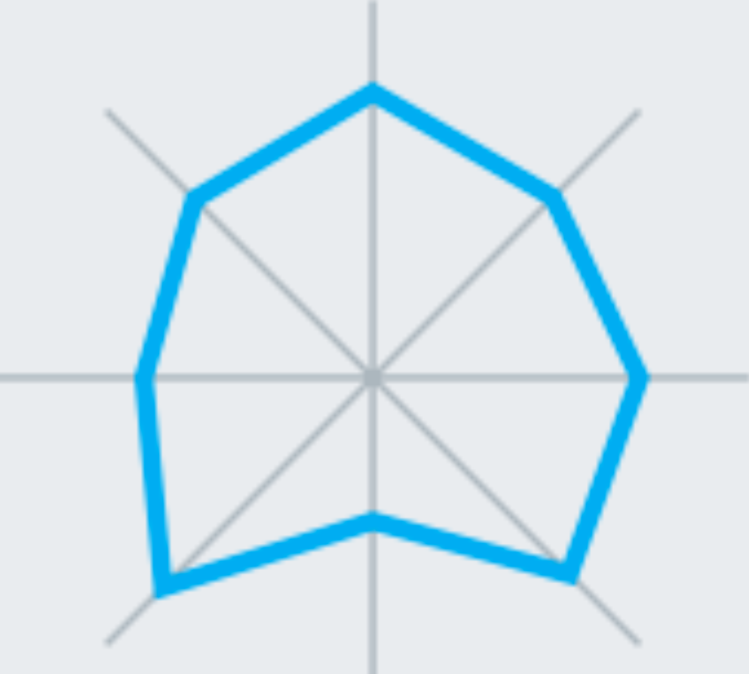
Also known as the Spider or Radar Chart, the Circular Area Chart, this chart shows the different dimensions such as scores and rankings of one item. The further out a point is from the center, the higher it ranks in a category.
WHEN TO USE A CIRCULAR AREA CHART
Circular area charts are a great way to compare members of a dimension in a function of several metrics. For example, when you want to buy a smartphone, you can use a radar chart to compare several devices across several metrics like battery life, camera quality, and memory capacity.
Source: Tableau
EXCEL
