Distribution > Single Variable > Many Data Points | Difficulty: Medium
.
TABLEAU
This method is slightly more difficult than bar histograms in that you must manually create your own bins. This is done by doing the following:
CHOOSE MEASURE > CREATE > BINS
COLUMN: Measure (bin)
ROW: CNT(Measure)
WHAT IS A LINE HISTOGRAM?
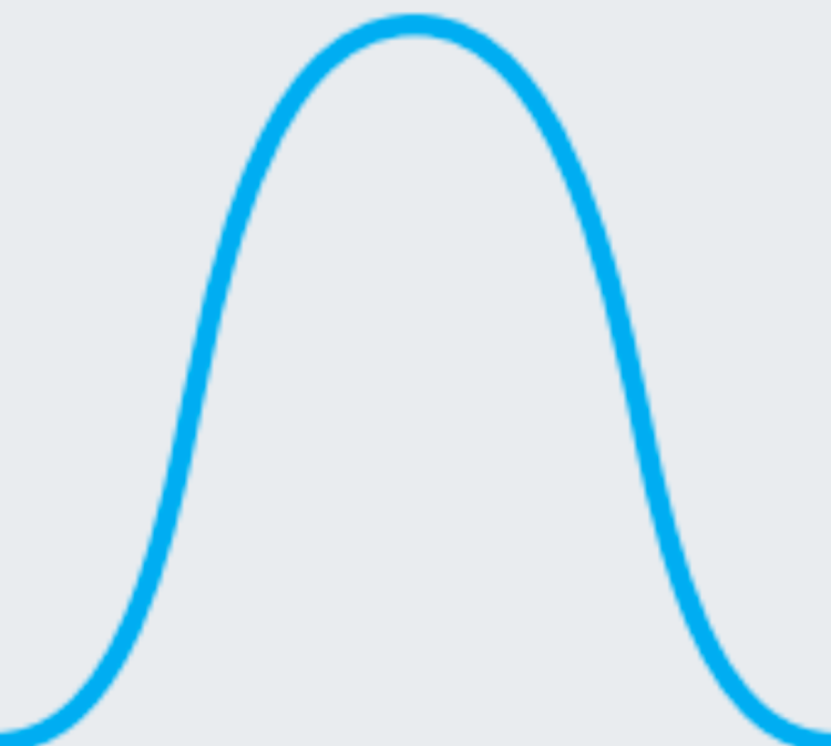
Contrary to a line chart, the line histogram shows the distribution of one variable rather than the comparison between two variables. When a line chart is used to depict frequency distributions like a histogram, this is called a frequency polygon.
WHEN TO USE A LINE HISTOGRAM
If you have binned numeric data but want the vertical axis of your plot to convey something other than frequency information, then you should look towards using a line chart. The vertical position of points in a line chart can depict values or statistical summaries of a second variable.
Histograms are good for showing general distributional features of dataset variables. You can see roughly where the peaks of the distribution are, whether the distribution is skewed or symmetric, and if there are any outliers.
Sources: Chartio
EXCEL
This method is slightly more difficult than bar histograms in that you may need to manually calculate your own midpoints (and frequencies by bin). This is done by adding the endpoints of each bin and dividing by two.
INSERT > CHARTS > SCATTER > SCATTER WITH STRAIGHT LINES AND MARKERS
